While Liverpool’s home kit has been red since 1896, their shirts on the road have been an array of colours and styles over the years, as this history of the kit details.
Charting the history of the Reds’ kit at Anfield is pretty straightforward—while they began in blue and white, the club shifted to their iconic red four years after their inception.
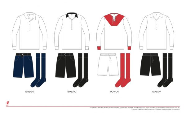
The need to wear a change shirt for away games, with a different colour than the home offering to ensure no kit clashes, saw Liverpool opt for white in their early years.
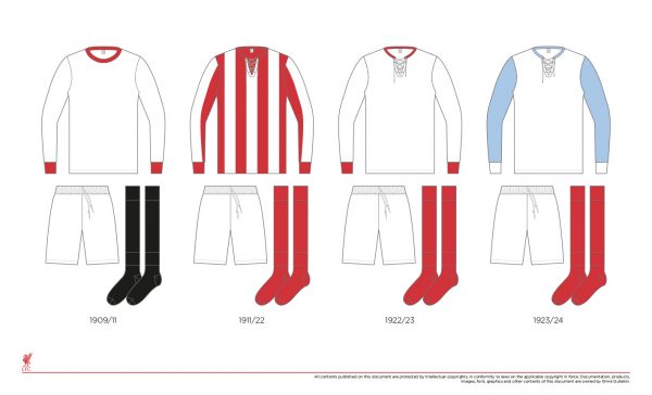
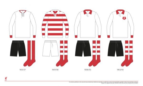
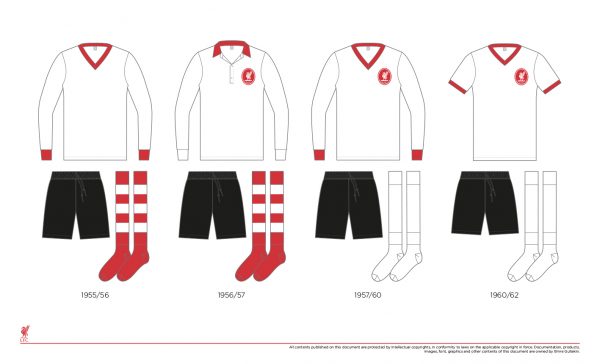
From the year they were formed to the late 1970s, the Reds’ away kit was predominantly white, with many iterations also including red in some form.
Perhaps controversially now, the away kit of 1923/24 featured blue sleeves, before soon moving back to a more acceptable white-and-red combination.
A shift in fashion in the 1980s saw Liverpool introduce yellow, designed by Umbro, before mixing it up with white and then grey as the decade wore on.
Moving to Adidas in the 1990s brought a bold leap as the brand used the teal that is now accenting the home kits of 2020/21, and as the seasons have gone on, the designs and colour schemes have been increasingly varied.
This came due to the requirement of a ‘third’ kit, to avoid further clashes and, for the more cynical among us, for an opportunity to sell more shirts.
Some have been more popular than others—remember the ‘Toxic Thunder’ offering from New Balance in 2016/17?—but more often than not they have been proudly and distinctly Liverpool.
After Nike unveiled their divisive ‘hyper turquoise’ away kit for 2020/21, we take a look back through Liverpool’s away and third kits thanks to the brilliant work of Emre Gultekin.
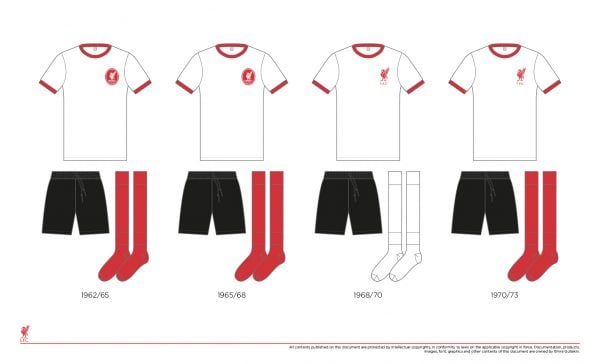
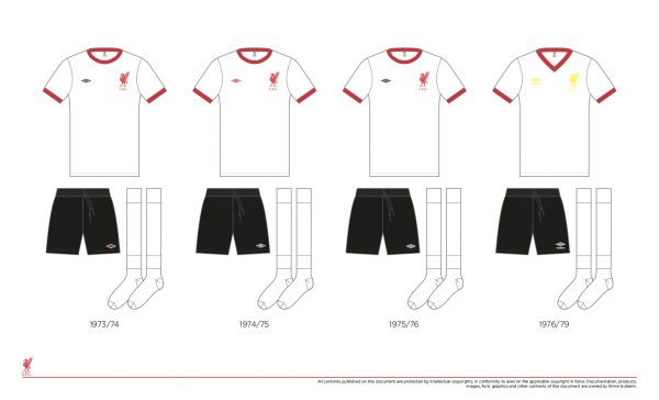
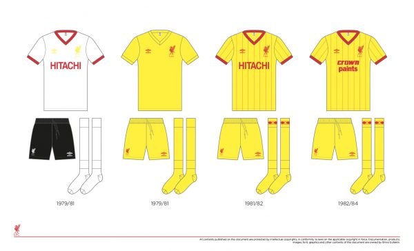
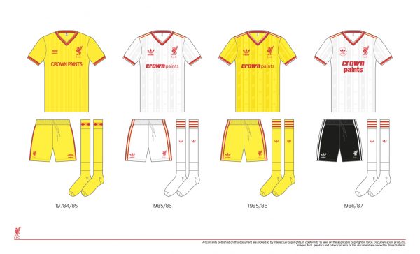
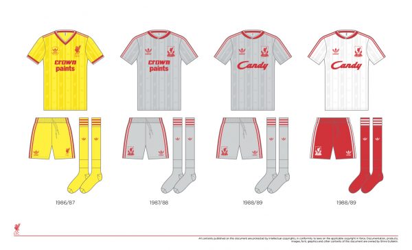
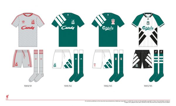
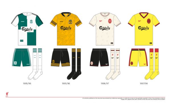
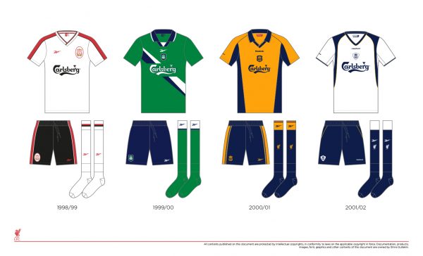
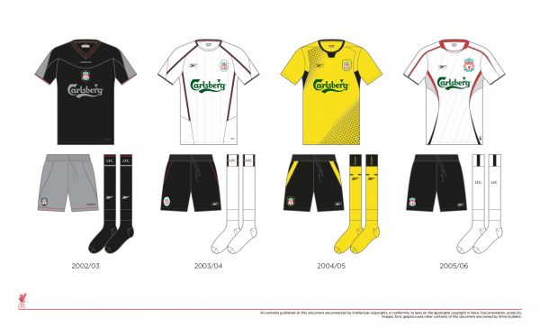
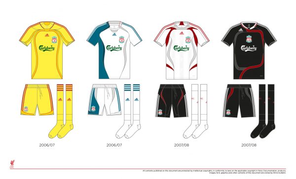
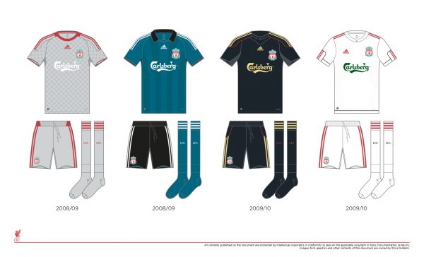
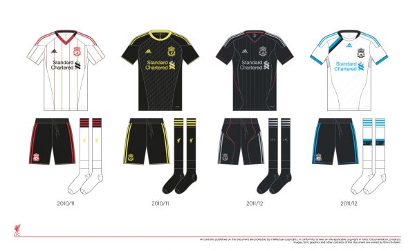
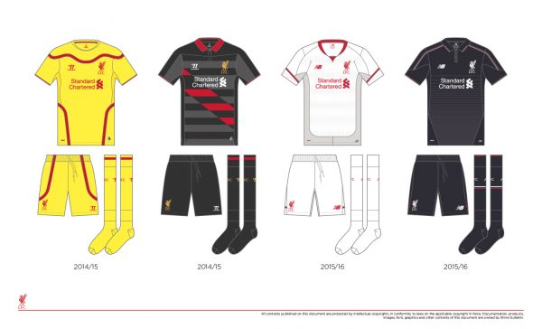
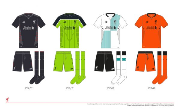
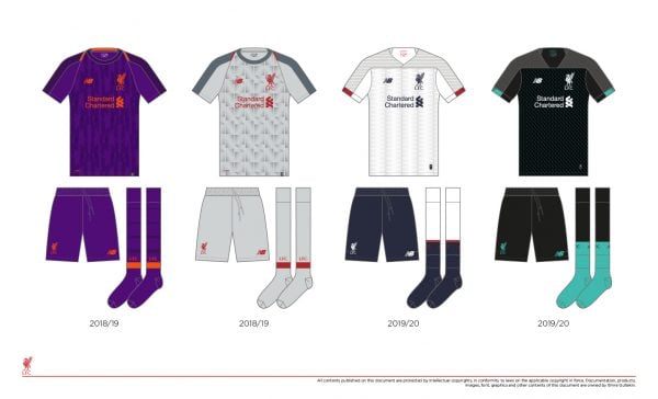
* Find more of Emre’s designs at Behance and follow him on Instagram.



Fan Comments